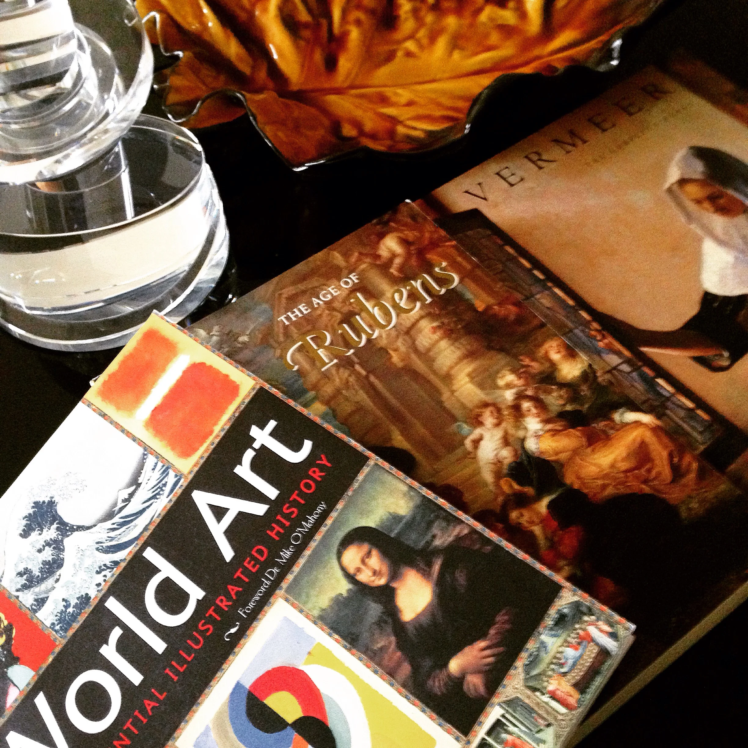
Early #Mothersday #gift! ❤️❤️
Photo by Raji Radhakrishnan
Artists I Love
Early #Mothersday #gift! ❤️❤️

Photo by Raji Radhakrishnan
Almost always a truly spectacular piece of furniture is born when unusual forms and materials fuse together perfectly and envelope what is a fundamental base for functionality. That's easier said than done. Unless you are born in an artistic family, raised and taught to be an exceptional craftsman, have the will and the tenacity to explore working with new materials and forms mid-career and in essence if you are Christophe Côme. The French artist and furniture designer creates furniture that are really sculpture portrayed in the form of furniture. His most unusual furniture pieces invariably steal the show even in a room filled only with the finest of furniture and art. I should know as I showcased one of his cabinets in the 2011 Hampton Designer Show House and where every person who walked into the room had to ask about this cabinet and who it was by. The facets and dimensions that the glass pieces create is pure magic and it is all due to the clever shapes, placement and encasement within finely sculpted steel that is Côme's signature style.
His Loukoum lamps are another favorite of mine. Like an ice block glowing from within. A simple idea but executed in the most beautiful way acting like jewelry in a room. Even in a room with my large murals and exceptional vintage furniture, his lamps quietly made people gravitate towards the desk where I placed a pair of these lamps on it. As odd as it may sound, being in the company of great pieces like this does certainly feel like you've been whisked away (think Woody Allen's Midnight in Paris) to a time and place where the intellectuals and the artists met, discussing fervently the most important issues of our time. The dialogue and interaction that each have with the other then become of utmost importance but it all starts with the integrity, craftsmanship and style of each piece and that in turn starts with the kind of person, the artist who created them in the first place. And for that reason and beyond, Côme won my heart a long time ago...
xo, Raji

2011 Hampton Designer Show House Designed by Raji RM featuring a Christophe Côme cabinet
Has this ever happened to you? You come across a material or color that you fall in love so much that you want to cover every object or surface you possibly can with it? Or you start with one and you love it so much that you continue looking around for other objects or surface you can cover it with?! And I wonder if that's how it started for Christian Astuguevielle and his rope furniture. Surely, it's far more deeper, well thought out et raisonné. When I first came across Astuguevielle's rope furniture in early 2000s, I thought they were absolutely incredible, sculptural, very impractical and loved them!
Over the years as I have explored objects searching for the unusual, the difficult, sometimes unseen and unheard of, I came across many interesting rope clad works including lighting by the likes of Adrien Audoux and Frida Minet. But, I have grown to love furniture covered in this age old, rough, pliable material that requires acute precision and the eye of an artist to create a truly beautiful object more passionately than any other material and now have immense respect for Astuguevielle's work. His ability to take a mundane object and create a sculptural presence once he encases them in cotton cord, twined fiber or hemp, is pure genius. So what if they are sometimes robbed of their daily use especially when they are imbued with such a tactile quality, begging you to touch the stiffened ropes and feel the knuckled knots all while they take on a persona far more interesting and potent than most other objects in a space.
And what less can you expect of a man who has been the artistic director of fashion houses like Nina Ricci, Rochas and Hermès as well as the nose behind the fragrances produced by the Japanese design house Comme des Garçons. Well groomed and seasoned, enriched and exposed, Astuguevielle's work is the embodiment of knowledge and refinement that transcends the ordinary to extraordinary. Sublime et tout ma tasse de thé!
- xo Raji
Images of Astuguevielle's Paris apartment via Elle Decor (Espana)
Images of Astuguevielle's furniture via Holly Hunt
Great vintage originals have always been in vogue and are very often replicated. However, it's one thing to find vintage furnishings that look so right for today but an altogether different experience to find those that look like a perfectly made contemporary design but are in fact vintage. It is pure bliss and exactly how I feel about the French artist, Guy de Rougemont (born 1935). A prolific painter, sculptor who also designs furniture till date and tapped by the influential French designer Henri Samuel back in the 1970s. Guy de Rougemont's iconic Cloud Table designed in the 70s and in different variations is shockingly au courant and hard to believe he designed it nearly four decades ago! His Table Nouage Rouge (Red Cloud Table) from 1970 seen above is a good example.
One look at his work on canvas, murals, totems and sculptures can tell you how he uses abstract art to interpret his view of the world in a rather baroque and colorful way. It is said that Guy de Rougemont has thought of cities as jungles and has tried to create, through his interventions, ways to penetrate and resonate with his surroundings. Not limiting his art (or his thinking) to canvases, his work extends to sculpture, furniture, objects, rugs, stained-glass windows (of course!), porcelain, ceramics, stamps, posters and more recently wine labels. And the fact that he continues to create art and objects that are not only very much his style but always relevant and avant garde at the same time is not an easy feat. Neither is being always one step (or several steps) ahead of his time. I for one find that the causal and casual effect of having a piece of art made functional and amidst other "regular" furnishings, a delightful and unique experience and one that I would love to see adopted in more interiors!
- xo, Raji

Guy de Rougemont 1992; Photography by Michel Baret

Inage via DianedePolignac.com
Images from Flickr & Pinterest
“The dramatic sufferings of adults and all the cruel fantasies of those of my own age, who seemed abandoned to their own impulses in the midst of so many catastrophes, appeared to inscribe themselves on the walls around me.." - Antoni Tapies
His works remind me of Cy Twombly. But it seems he was once influenced by Joan Miró and Paul Klee. Then he abandoned these influences to what became his signature style of work - "the heavily built-up surfaces that were often scratched, pitted and gouged and incised with letters, numbers and signs" - William Grimes, New York Times. The critic John Russell said it best and referred to his works that “seemed to have been not so much painted as excavated from an idiosyncratic compound of mud, sand, earth, dried blood and powdered minerals.”
Far from morbid and suffering thoughts (especially for a Monday morning) and as much as a happy person that I am, there is something about Tapies' work that draws me, captivates me and makes me want to discover more of him and his work. What can I say, other than, il est tout ma tasse de thé!
Images via NYTimes.com & Flickr
What makes a furniture or object collectible? For me, it should first be absolutely divine in its creation - that means nothing like you've ever seen before but also something that makes you wonder how in the world they created it. The furniture is usually architectural or sculptural with considerable engineering, artistry and skills behind it. In the vintage collectibles category, so many great vintage designs are being copied easily today but when Jean Prouvé originally made his Compas table in the early 1950s it was no ordinary table for his time and the technology available then. If you could get your hands on an original Jean Prouvé piece, that is a collectible. In contemporary furniture design, there are a handful of product designers today whose works are highly coveted. Their work straddles functional furniture, technology, science, architecture and art. Those of Elizabeth Garouste & Matteo Bonetti, Marc Newson, Ron Arad, Zaha Hadid and Claude & Francois-Xavier Lalanne come to mind. In a way, a collectable also has something to do with demand and supply and unless it's a prototype, vintage or contemporary, mass production is not a collectible. Limited editions can be collectibles. But when a piece is truly extraordinary and innovative it is usually also one that is incredibly difficult to make. They are crafted meticulously with unusual or new materials, using complicated machinery and tools requiring highly skilled labor and in a very controlled environment like a lab. An engineering and technological feat almost every time it is made thus taking a serious amount of time to produce and hence very rarely available. In this sense, these pieces are a rare work of art.
Joris Laarman, a young Dutch designer is one of those contemporaries I very much admire as he defies what functional art is and can be - a true innovator in every sense of the word. Many of his creations are very much a collectible attested by the number of world class museums that have added his work to their permanent collections. Like many of his predecessors who have experimented with new materials and design and where some of their creations were translated from their original designs leading to mass productions (while others, often due to their complexity, remain limited custom creations), Laarman's experiments have led him to fantastical creations while constantly trying new possibilities, most recently, with 3-D printing. The thing to note though is that he is not only innovative in his design and his manufacturing process he is also creating the all important new "digital" material that will work through a 3-D printer to create his furniture. Of course some of his 3-D printed designs will eventually lead to mass production. But I can't help but think that, as we sit in the brink of a new generation of design, Laarman gives new meaning to the term "pushing the envelope". What can I say, Il est tout ma tasse de thé!
- xo Raji
All images via JorisLaarman.com and via Flickr
Several years ago during a visit to India I came across a shop in Madras that carried paper lantern shades. On seeing them I turned to my mother who was with me and blurted that it looks somewhat like the Noguchi lights. I actually didn't know much about Noguchi at that time except that I loved his gorgeous lights which I saw in the pages of shelter magazines and I must have caught his name in the captions. I made a note to look up Noguchi once back home and I did. To my surprise, I learned that the Noguchi museum was right here on the east coast in Long Island City, Queens.
Little did I know that my trip then to the Noguchi Museum would be the first of several more visits thereafter. The peace and the quiet of the space and the garden itself are so rewarding and worth the trip every time. Add to that, getting up close and personal with some of Noguchi's greatest creations and it starts to feel giddy just to see the sheer variety of materials and mediums he was fluent in - marble, alabaster, onyx, stone, slate, steel, brass, bronze, aluminum, stainless steel, magnesite, wood, terracotta, plaster of paris and much much more. He was an artist, a sculptor, a furniture and lighting designer who also happened to design architectural spaces including the Noguchi museum and it's garden. And I thought he just made lamps out of rice paper.
I remember thinking how easy and very possible he made it all look and how limitless imagination and creativity can be when coupled with a huge dose of effort and tenacity. It was during one of my early visits to the Noguchi Museum that I first thought about becoming a designer and the kind of designer I wanted to be - one who is hands-on whenever possible and unafraid to try new and different things even if the task at hand feels monumental and the risk quotient seems high. I'm thinking of Noguchi and some of his peers as we continue working on a project I started on nearly seven years ago in Bethesda, MD. This is a project close to my heart as the clients are some of the nicest people I've known for a long time now and their trust has given me the leverage to literally take a paint brush to their home and exercise some of my more daring ideas. It is immensely satisfying when you don't just design and orchestrate a crew of people to bring your vision to life but also have the chance to create something personal and unique with your very own hands.
Here's to being inspired, taking measured risks and trying out new things!
Below are some of my favorite works by Noguchi. Notice how current and in fact cutting edge some of his early works are.
Photos via Noguchi.org and Pinterest.

Interior Detail by Raji RM & Associates; Photography by Rikki Snyder;
Most in the interior design and fashion industry have heard of Line Vautrin, thanks to 1stdibs and Maison Gerard. Her ecclesiastical mirrors, quixotic boxes, whimsical trinket trays and gorgeous jewelry are coveted and collected by many including Madonna, Paloma Picasso and Kawakubo, the founder of Comme des Garçons. Born into a family of Parisian metalworkers, Vautrin learned her casting, chasing and gilding skills in her father's foundry workshop. I love the fact that she started out as a greeter for fashion designer Elsa Schiaparelli, albeit very briefly. Later, when she was just 20 she started making her "little somethings" and offered her creations door-to-door. Sometime later she also worked with one of my favorite designers, Jean Royère who included her mirrors and gilded boxes in his commissions and soon she opened her own showroom and finally ending up with an atelier on the Rue du Faubourg Saint-Honoré.
My encounters with the works of Line Vautrin (1913 - 1997) were quite serendipitous. The first time I saw her work in person was while walking down a street in the Marais district in Paris in 2007 and I stumbled upon a beautiful shop lined with several (I'm talking over a hundred of them) Line Vautrin mirrors, poudriers et boites! I was first speechless and then a bit giddy standing in the middle of that little shop staring at the incredible pieces. The kind and very discreet French gentleman who owned the shop (which only had works by Line Vautrin, Georges Jouve and a few others) very sweetly indulged my questions and deer with antlers gaze until I very reluctantly left the shop. If I say I am inspired by Line Vautrin that would be quite an understatement.
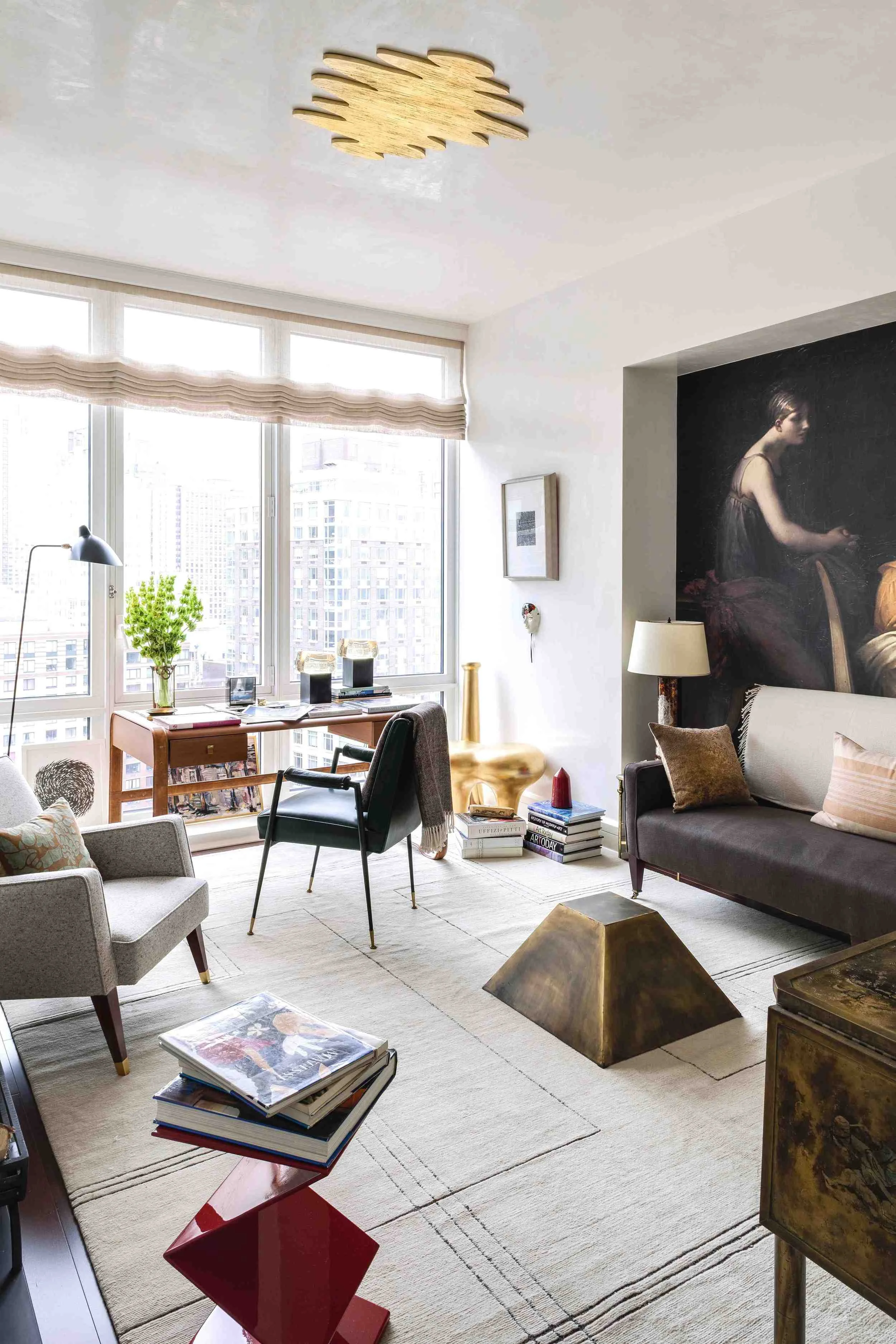
In a recent interview, I mentioned how an art work - one that you don't even own - can inspire a room's design. That is precisely what happened several years after I saw Line Vautrin's work in that little shop in the Marais. It was a particular gilded bronze poudrier, called La Mer, that inspired a modern ceiling medallion I commissioned the lovely Eva of Christianson Lee Studios to create for the ceiling in my room at the Kips Bay Show House. It was quite literally jewelry for the room and a surprising one at that when placed on the ceiling.
Last year, when a collection was on display at Maison Gerard in New York, I finally got my hands on a couple of pieces by the Poetess of metal (as Vogue dubbed her). What can I say other than il est tout ma tasse de thé!
p.s. If you like Line Vautrin, you must read this beautifully written obituary by The Independent.
Below are some of my favorites by Line Vautrin. Photos from Pinterest, WSJ, Wallpaper*, Financial Times;

2012 Kips Bay Show House Room designed by Raji RM & Associates featuring the ceiling medallion inspired by Line Vautrin's La Mer; Photography by Marco Ricca.
What do you think of when you see a work of art? Or how do you react? When I walk through a museum or gallery my emotions tend to run the whole gamut. Everything from no reaction to "whoa" to complete entrancement. Of all these emotional reactions, I don't recall stepping back and thinking "strength" or "strong and masculine" as I have when seeing the Spanish artist, Eduardo Chillida's (1924-2002) work. Mind you I'm not looking at sculptures or paintings of men flexing their muscles or torsos with six packs here. These are modern art. I want to say abstract but I'm afraid the artist may not like that. So, let's just call it "Modern Compositions" for now.
I first discovered Eduardo Chillida's work in a small art gallery in Munich, Germany. It was a collection of black and white lithographs. Compositions in black and white is nothing new, in fact, it is one of the oldest type of works in modern art and are part of nearly every major artist's work till date. But there was something very strong about these compositions that made me ask the gallerist more about them and eventually buy them. As I explored Chillida's works, I realized most described his work as having movement and tension. And that is true. But, for me the one word that comes to mind is still Strength. Perhaps, it has something to do with his early works in clay while in France and how he associated clay with the white light of Greek sculptures and they eventually manifested in his hands as re-interpretations in a stronger material and in a more undefinable form.
An artist who not only studied art but also architecture, Chillida's most famous and celebrated works are monumental outdoor sculptures made in steel and concrete but he also worked beautifully with so many other materials including alabaster, wood, clay, gypsum, bronze, felt and of course hand made paper. Some of his stone sculptures seem almost primitive yet are so modern it reminds me of advanced intelligence. Think Fifth Element (I love that movie). My favorite among Chillida's works is "The Basque Liberties Plaza", 1980, reinforced concrete and steel. I think that might be because it reminds me of a different time and place - my grand father and his home where I spent much of my childhood. More on that later...but for now, I'm happy just rediscovering this artist whose work I relate to at so many levels and I think a trip to the Basque Country side is very much in order.
I hope you have an inspired Monday morning! - xo Raji
Photos from Flickr and Pinterest

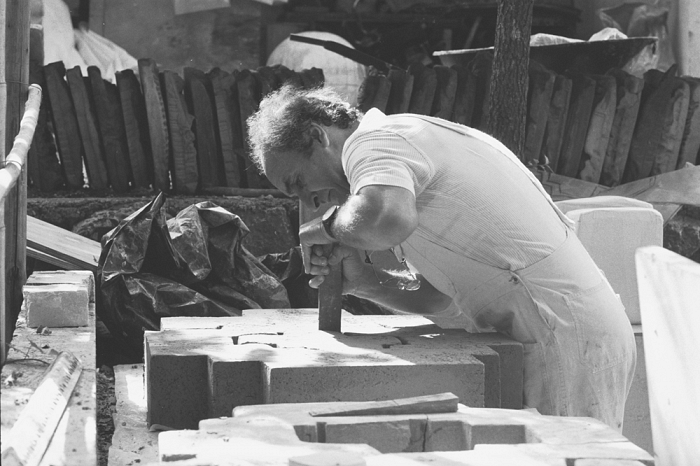
Chillida modeling a clay sculpture in 1973; Photography by Ernst Scheidegger

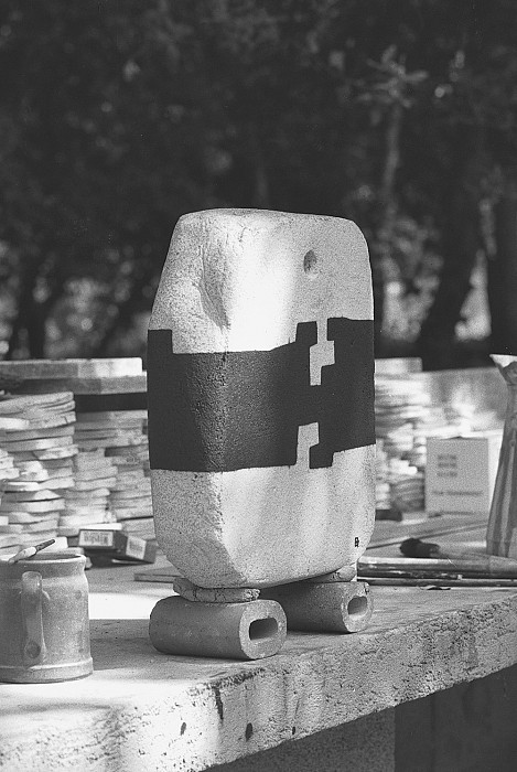
A painted clay sculpture, 1973 - Photography by Ernst Scheidegger
It isn't an entirely new concept when designers talk about sculptural furnishings. It's been a stylistic aspect of many designer's work for decades and something I strive for in most interiors I create. My personal thoughts have always been that whenever possible make the furnishings (that includes furniture, lighting and accessories) as sculptural as possible but hopefully not at the expense of comfort or practicality. If comfort was the only objective, I think it would make for pretty but bland and boring interiors. On the other hand, if beautiful and sculptural furnishings were the only objective then the rooms tend to feel like museums. Hence the adage, a balance between form and function. One way to do this, is to keep all the key pieces of furnishings in a room as practical and comfortable (and beautiful) as possible and then introduce at least one terrific piece even if it is purely for it's sculptural presence.
There are many beautiful and sculptural furniture out there but to me the ones that are the epitome and the very definition of sculptural furniture are those made by the Lalannes. Of late, auction prices for the Lalannes have skyrocketed so much (and for good reason) that it makes acquiring one of their pieces as rare and pricey as a Picasso. The husband and wife duo, the late Francois-Xavier Lalanne and Claude Lalanne, both worked and exhibited together and you can see how much their thoughts and works were in unison. They had different subject matter preferences. Francois preferred over-sized animal figures with secret compartments, whereas Claude, now 86, enjoys flora over fauna and also worked on jewelry and more intricate and smaller subjects. But the sculptural quality, materials and the basic whimsical nature of both their pieces spoke to each other so well that I think one picked up where the other left off. That is the kind of flourish that's hard to come by. And the kind of work that I think will inspire us for centuries and generations to come. Il est certainement ma tasse de thé!
These are some of my favorite Lalanne pieces - images via Flickr & Pinterest
Raji RM & Associates | Interior Designer & Decorator
Washington DC | New York
Contact us to learn more about our work